At the same time that in-person fundraising efforts were put on hold, the need for donations grew. Further, as new generations gain giving power, online giving and digital connection are becoming key outlets for supporting nonprofits. Because of this, your nonprofit’s website has stepped into the limelight as a primary channel for collecting donations.
This is where the conversion rate of your website comes into play. Conversion rate describes the percentage of website visitors who complete a desired action, whether making a donation, signing up for an email list, or another type of online engagement. To optimize your site and bring in more donations, it’s important to track and understand how certain elements of your website can impact your conversion rate.
In one 2019 study, only .17% of website visitors made donations. If your nonprofit’s website conversions stayed at this less-than-one-percent rate in 2020, you may have felt the impact on your bottom line.
However, there are a few impactful changes that you can make to your website to create a stronger donor experience and boost conversions. We’re going to cover these updates in the following categories:
- Design Elements
- Call-to-Action (CTA) Strategies
- Technical Streamlining
At Cornershop Creative, we’re experts in nonprofit web design and development. While working with organizations just like yours, we’ve seen the difference that effective design can have on conversion rates and nonprofits’ abilities to grow their missions over time. Let’s dive in.
Design Elements
A bland, dated website will do little to motivate site visitors to donate to your cause. As you can see in this Cornershop Creative guide to the best nonprofit websites, your site’s overall design should be fresh, attractive, and motivating to inspire site visitors to give.
Balance informational copy with visually appealing elements, such as impactful imagery of donations at work, video testimonials of volunteers, modern typography, and subtle animation. This will draw users in, keep your nonprofit’s “big picture” mission front-and-center, and push them closer to conversion. But, be mindful not to overdo it, as you don’t want to overwhelm users and distract from the rich informational content about your cause.
Beyond being attractive and motivating, the overall design of your website should be straightforward and simple to follow. Your website’s main navigation menu should follow an intuitive content hierarchy, ensuring donors can find the most pressing pages (such as your donation form) with ease.
Last, but certainly not least, all of your site elements should be mobile responsive. This means that regardless of the screen size (mobile phone, tablet, desktop monitor), the page elements should adapt to be clearly displayed. This doesn’t mean simply resizing to fit smaller screens but actively transforming. For example, less essential elements (such as a sidebar navigation menu) may be disabled altogether on smaller screens to preserve space for more essential elements.
Designing an effective donation form
Beyond the design of your website overall, we’d be remiss if we didn’t discuss the actual form through which your site visitors donate— your online donation form. This form needs to balance the needs of your organization and its donors, collecting the right amount of information without creating an inconvenient giving process.
The design of your donation form should prioritize user experience (UX), providing both a streamlined and secure giving experience. Follow these best practices:
- Set suggested donation amounts. Determine your average online donation amount and use that information to provide convenient suggestions to web donors. Use a tiered model to set suggested amounts. So, if your average donation is $25:
- One tier that’s slightly lower, at $20.
- One tier that’s slightly higher, at $30.
- One tier that’s even higher, but still reasonable based on the data you’ve gathered, at $50.
- One tier that’s well above average, at $100, with the goal of encouraging donors to give more than they would normally.
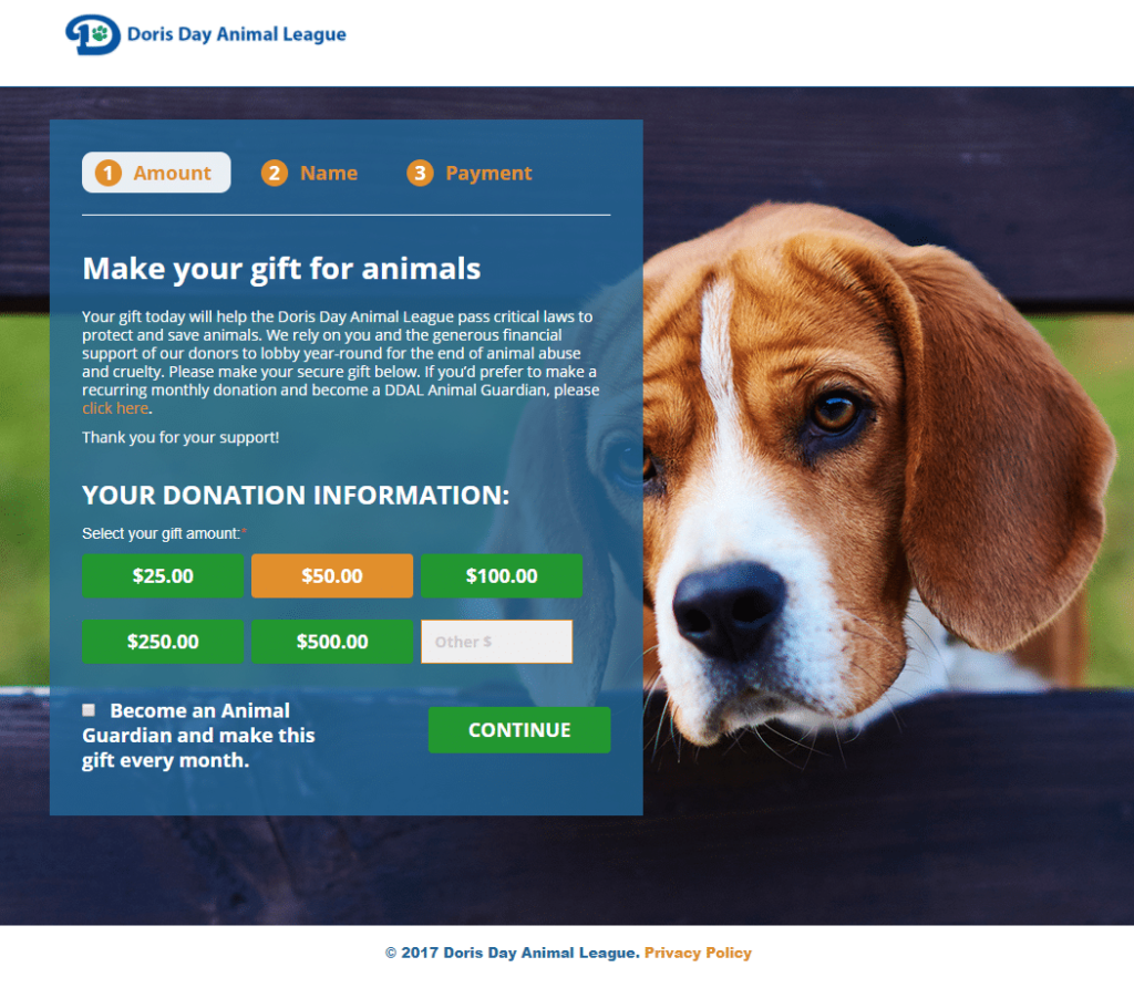
- Use multi-step donation forms. Essentially, multi-step forms visually simplify your online donation form by breaking the process out into click-through stages. It’s a more sleek, modern design and asks donors to answer one to two questions per step, rather than including multiple questions on a single form page. Check out the example below to see what we mean:
- Directly embed the donation form. Linking donors out to a third-party page to process their donation can lead to distrust in your online giving procedures. Just as you want your donation form to be integrated with your donor database for easy access to data, your supporters want to give to your organization directly on your website.
- Streamline donation information. One in four donors gives via a mobile device. Streamline the giving process for smartphone and desktop supporters alike by limiting the number of fields required on your donation form, prioritizing essential contact and payment information.
And, if you’re unsure of whether you’ve designed an effective form, A/B test your donation page. A/B testing involves providing two different versions of your form to online donors and seeing which has the more positive response. You can test and fine-tune elements like:
- The wording of your fundraising ask
- Suggested donation amounts
- Number of required fields
- Images or other visuals included
- Multi-step form or one-page form
But remember, you should only alter one element at a time to understand which elements are truly having an impact. If you’re changing more than one, it will be challenging to discern which is the deciding factor for donors.
Call-to-Action (CTA) Strategies
CTAs, or calls-to-action, are elements that encourage visitors to take a specific action, such as making a donation, signing up for volunteer opportunities, or contacting their local political representatives. In the case of increasing online donations, the goal of your CTAs is to encourage donors to give and give them a clear way to do so (like by linking directly to your donation form).
CTAs should be clear, concise, and attention-grabbing. Here are a few strategies we’ve found that can shine a clear spotlight on your giving opportunities:
- Eye-catching donation buttons. Donors should always be a click away from giving opportunities on your website. Across your website, such as on your homepage, blog, and About Us page, include bold “Donate Now!” buttons.
- Lightboxes. A lightbox is an attention-grabbing pop-up that greets web visitors once they take a specific step on your website, such as navigating to your homepage or submitting a donation. These boxes should be visually appealing, use impactful imagery, and present straightforward next steps. Consider this CTA strategy on your homepage to direct prospective donors to your giving form, and on your donation page after a gift has been secured to encourage upgrading to a recurring gift. Check out the example below, pulled from Cornershop Creative’s guide to digital fundraising:
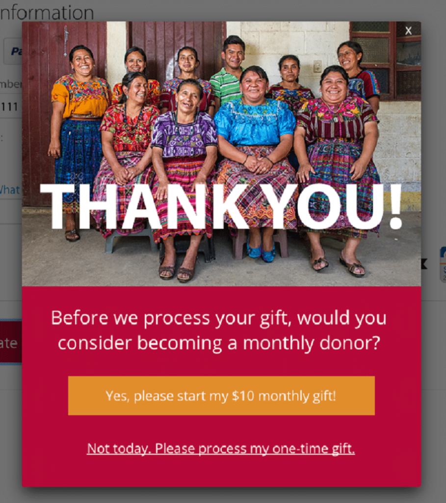
This lightbox stands out due to a few best practices, including an eye-catching, vibrant image and straightforward next steps.
- Links in multichannel communications. Whether you’re using social media, email, texting, or even direct mail to reach supporters, include links (or printed URLs) directing them to your website. Note that readers can learn about your nonprofit and make secure donations through the site so that opportunity isn’t overlooked.
Giving through your donation form is the final step for a site visitor— or is it? Securing that first donation is a breeze compared to securing the second one, often referred to as the “Golden Donation.” In fact, only 19% of donors give again after their first gift, but 63% of those who make it to the golden donation continue to give repeatedly over the long run.
Create a donor-centric website with features that engage the donor long after they hit “submit.” Outline clear next steps for your donors to follow post-donation, whether in a lightbox confirmation pop-up or an automated confirmation email. Each of the following tactics can help your website turn a one-time donor into a long-term supporter:
- Joining your email list to stay in-the-know with upcoming events and campaigns.
- Upgrading the one-time donation to a sustaining, recurring gift.
- Telling a friend (through social media) about the gift.
- Reviewing other engagement opportunities, such as volunteer and advocacy efforts, located on other pages on your site.
Or, you could use this opportunity to deploy one of the strategies for smarter fundraising while working from home— corporate philanthropy. Encourage donors to research their eligibility for matching gift programs in which employers will financially match donations made by employees. Bonus points here if you have a dedicated matching gift database embedded on your website so that donors can search their eligibility with ease!
With CTA language outlining clear next steps post-donation, your website becomes an engagement-generating machine.
Technical Streamlining
Technical streamlining refers to the behind-the-scenes updates that make your website operate in a more efficient manner. For example, rather than thinking only about the images that site visitors see, you should pay just as much attention to how fast those images load on visitors’ browsers.
Optimize the following technical elements to provide an inclusive, trustworthy, and efficient experience for all of your site’s visitors:
- Accessibility. Your website should be compliant with the Web Content Accessibility Guidelines (WCAG) to ensure that all visitors, regardless of ability, can engage with the site. A few highlights include providing alternative text for multimedia elements, including alt-text in all form fields, and following a logical content hierarchy. These considerations empower site visitors using screen readers to access your site with ease.
- Security. Your website should have a secure HTTPS (Hypertext Transfer Protocol) certificate. Most modern web hosts offer a free SSL certificate, but your site should actively enforce SSL— meaning visitors cannot access the insecure version. Additionally, you should work with a payment processor that ensures your data is encrypted and safe. Generally, if you’re working with a third-party, nonprofit-specific provider (think: EveryAction, Blackbaud, SalsaLabs, etc.), then you’re good to go.
- Page load speed. Your donors are looking for instantaneous information, not a 10-second wait time for the page to load. Use a tool (like GTMetrix or Google’s PageSpeed Insights) to measure how long your website takes to load and then take direct action to speed up the process. Pay attention to multimedia elements, such as images, to ensure the files are sized optimally for quick loading. Check that your web pages are caching effectively, which can reduce the work for your web host by loading cached versions of static pages. Finally, ensure your web host is prepared for spikes in traffic to your site and able to allocate resources effectively.
Technical streamlining of your website shouldn’t be a one-and-done effort. Conduct ongoing maintenance checks of your site to resolve any small issues before they snowball into big challenges. Something as straightforward as resolving broken links and optimizing design segments can go a long way toward providing a streamlined experience for potential donors. If your organization has an outdated website or you’re unsure of any of the concepts discussed above, you’ll likely benefit from working with a tech professional.
Streamlining the technical aspects of your website can have benefits beyond increasing donation conversions. For example, according to this Charity Engine guide, your website can be an impactful player in your multichannel marketing strategy. However, that’s only if it’s relevant, navigable, and accessible to all.
In conclusion, your website’s design, CTA strategies, and technical elements all play central roles in determining your ability to convert visitors into donors. So, what should your team’s next steps be to give it the best chance of success?
- Evaluate your website using these recommendations to discover gaps in its performance.
- Do additional research or consider working with a consultant to bring each element of your website up to standard.
- Maintain your website over time, rather than conducting annual one-time tune-ups.
Taking a proactive approach to using and maintaining your website will prevent a poor conversion rate from affecting your bottom line. Good luck!
Guest Author: Ira Horowitz

With 15 years’ experience, Ira is an expert in nonprofit online communications and online fundraising. His work has resulted in increased funds and resounding supporter engagement for hundreds of organizations.
Ira oversees our project management team and works with clients to provide our clients with the best possible final product. He also manages all of our strategic engagements and helps guide nonprofits to determine their long-term strategy goals for online communications.